Dual-purpose spaces don't work by accident. They require intentional planning — not just cramming furniture into a room and hoping it multitasks.
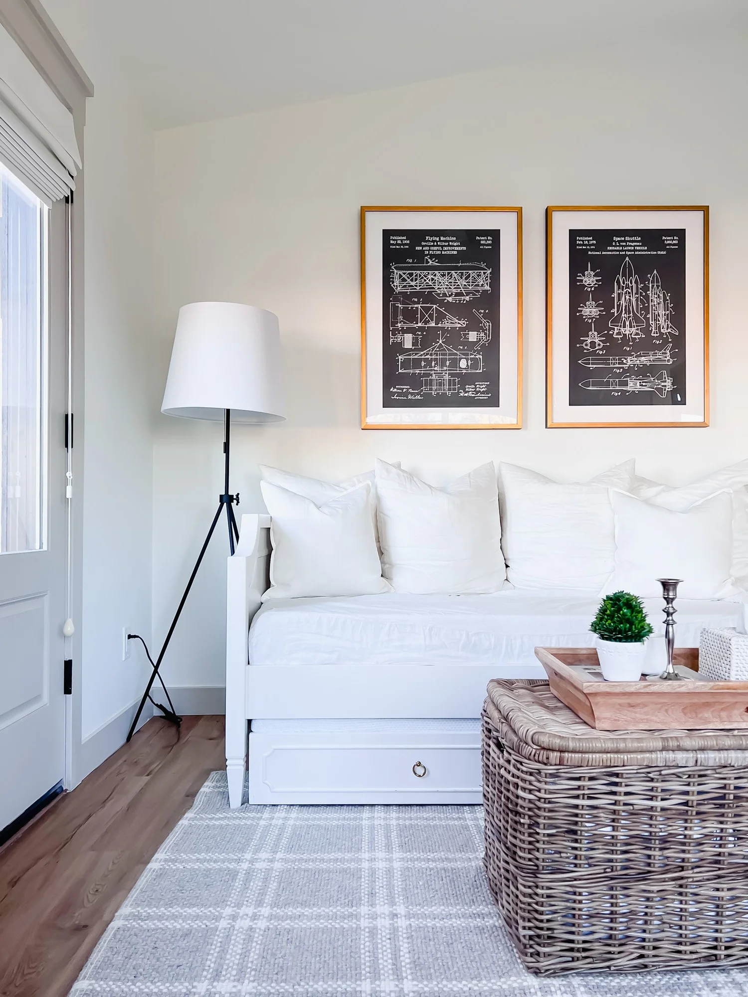
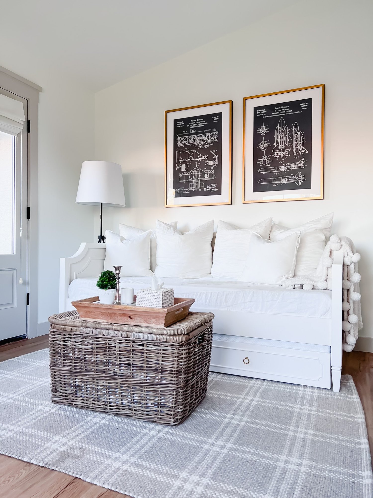
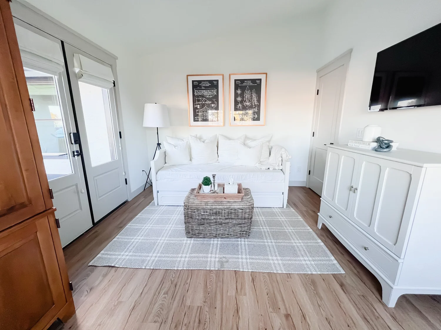
This new build needed to function as both an office and a guest suite. Small footprint. Two distinct use cases. The challenge wasn't decorating — it was programming. How do you make a space feel open when it has to accommodate a desk, storage, a bed, seating, and a full bathroom? You can't just add more furniture. You have to design the architecture itself to compensate.
The solution: vaulted ceiling for visual expansion. Exterior doors to blur inside and outside. Traditional millwork to add depth without weight. Accessible beige trim to keep everything feeling fresh, not fussy. The result is a room that feels larger than its square footage — which is the whole point of Studio Edit work. We don't just furnish spaces. We solve the spatial problems first, then layer in the design.
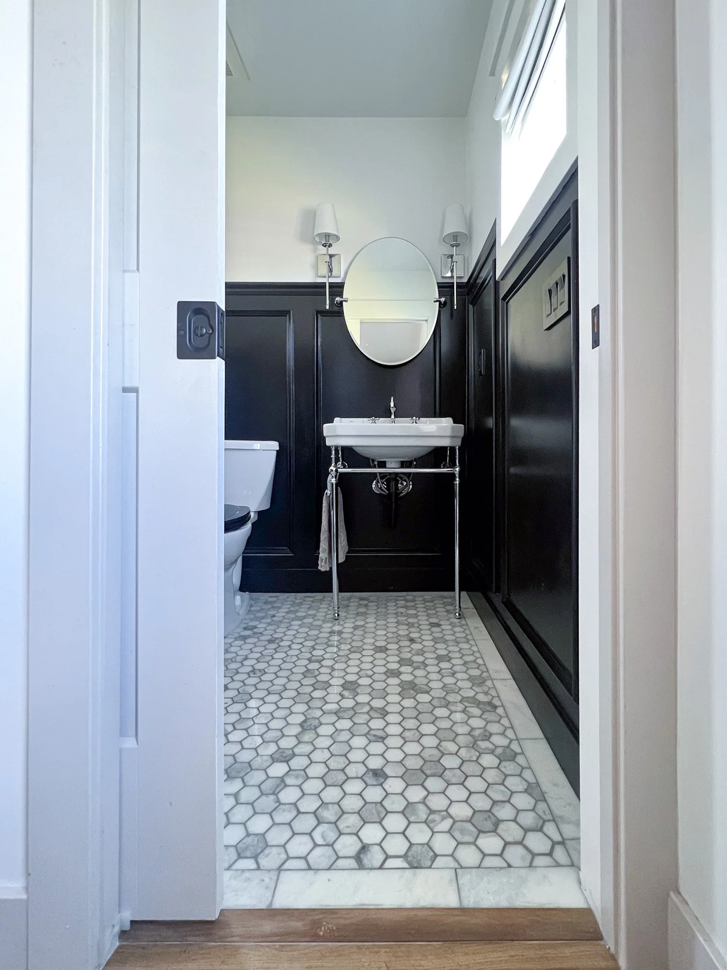
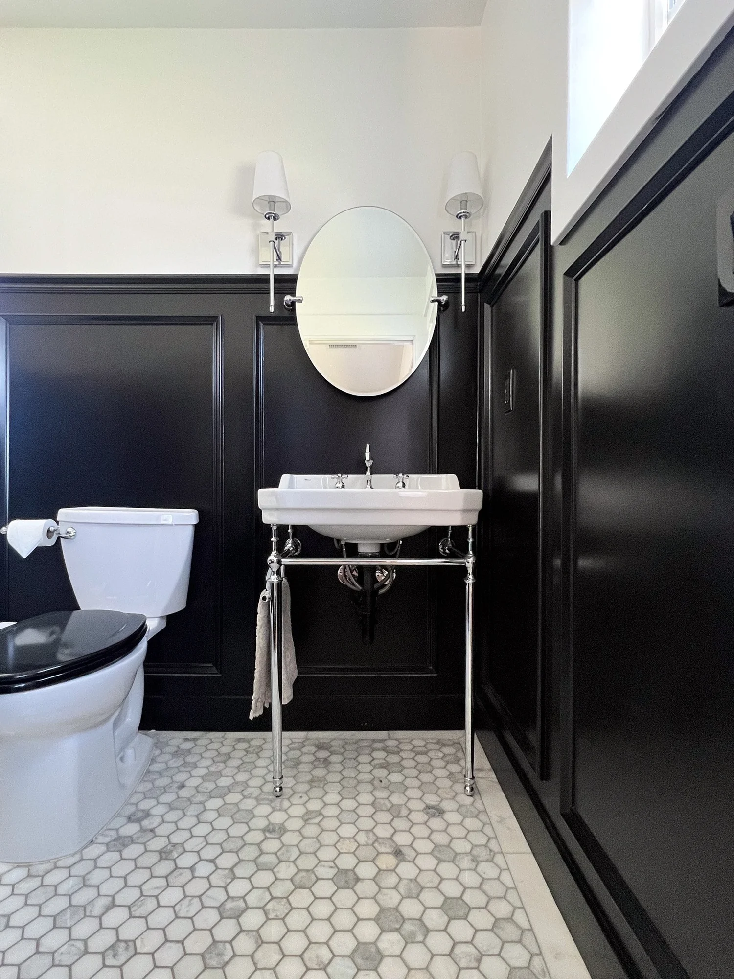
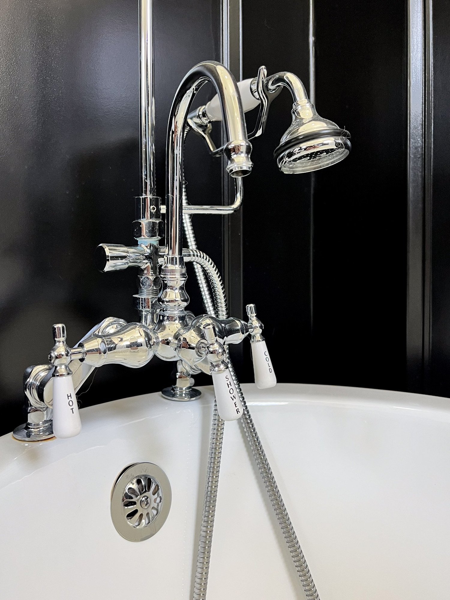
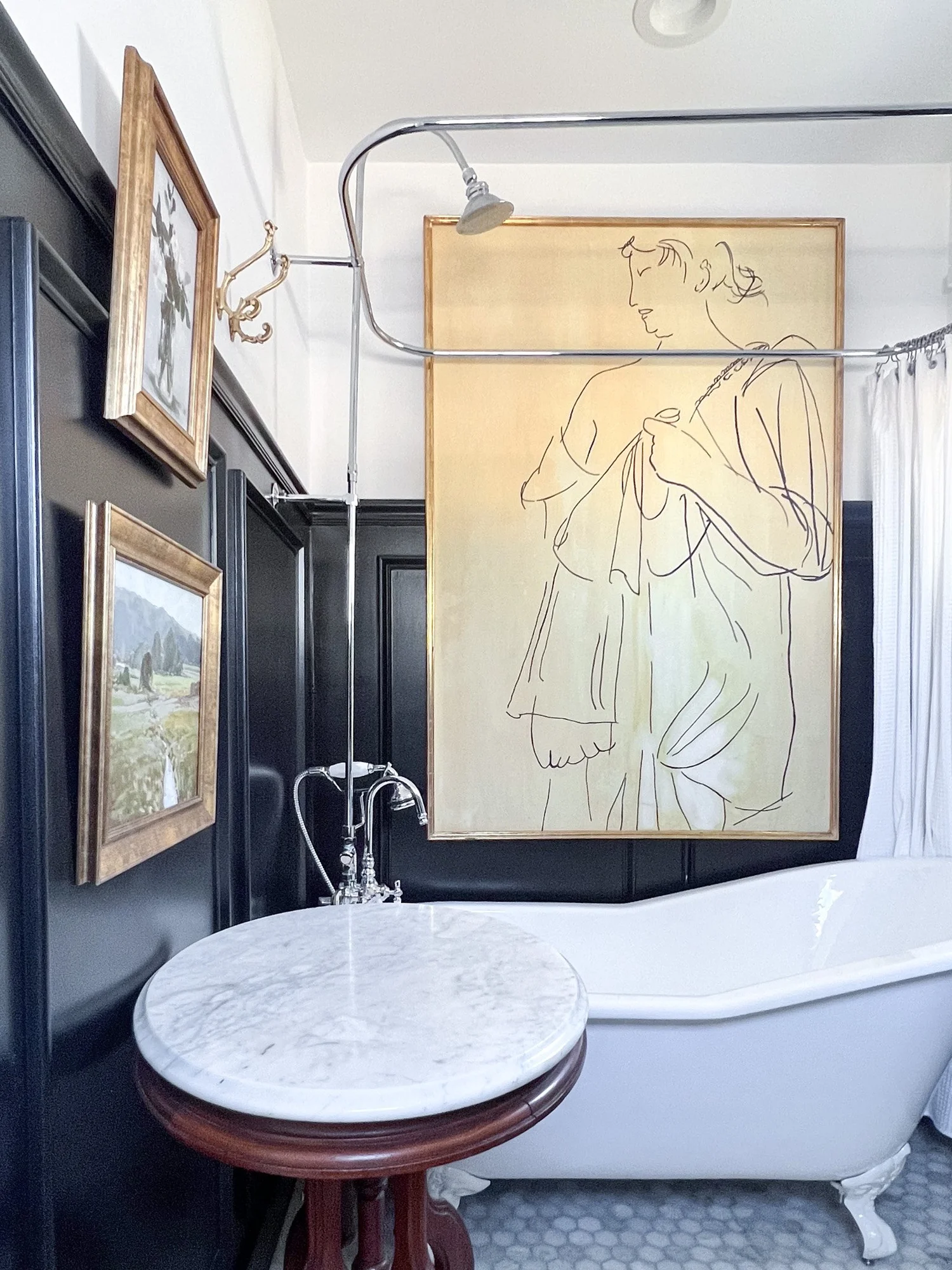
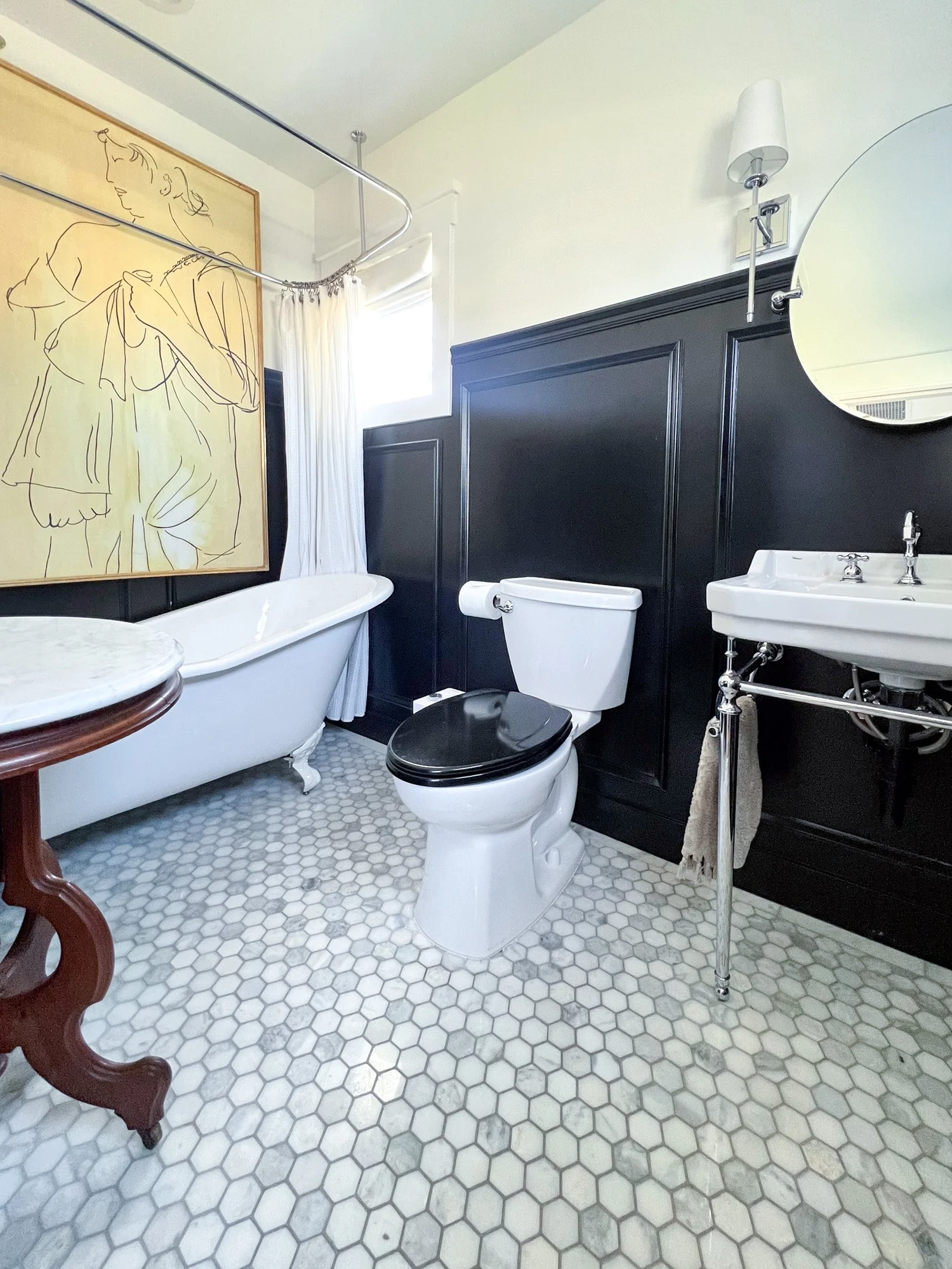
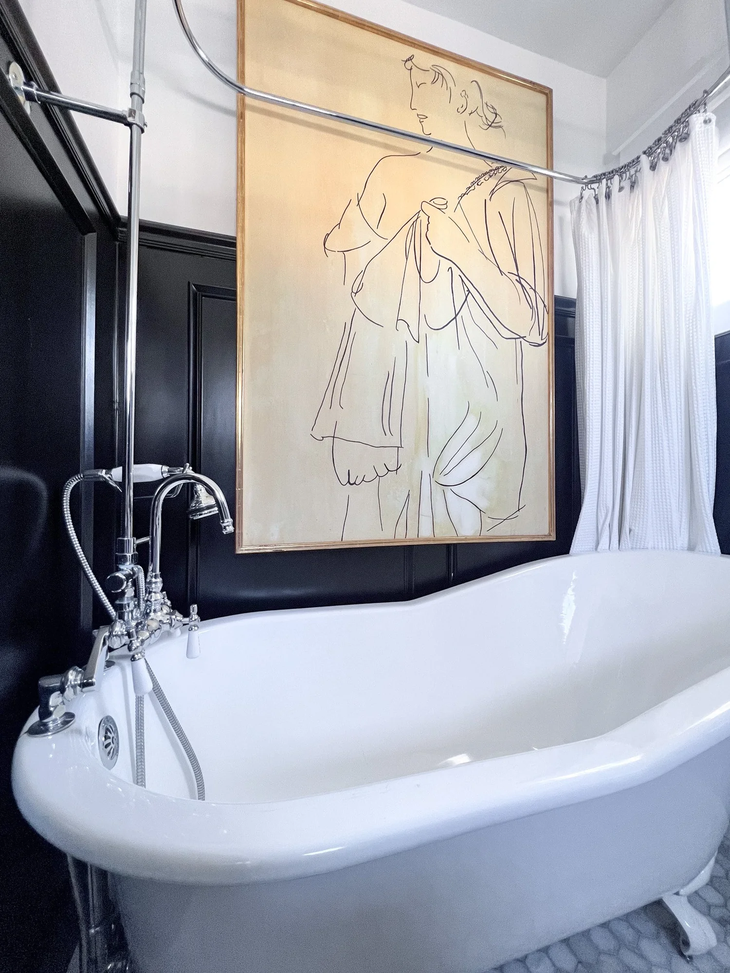
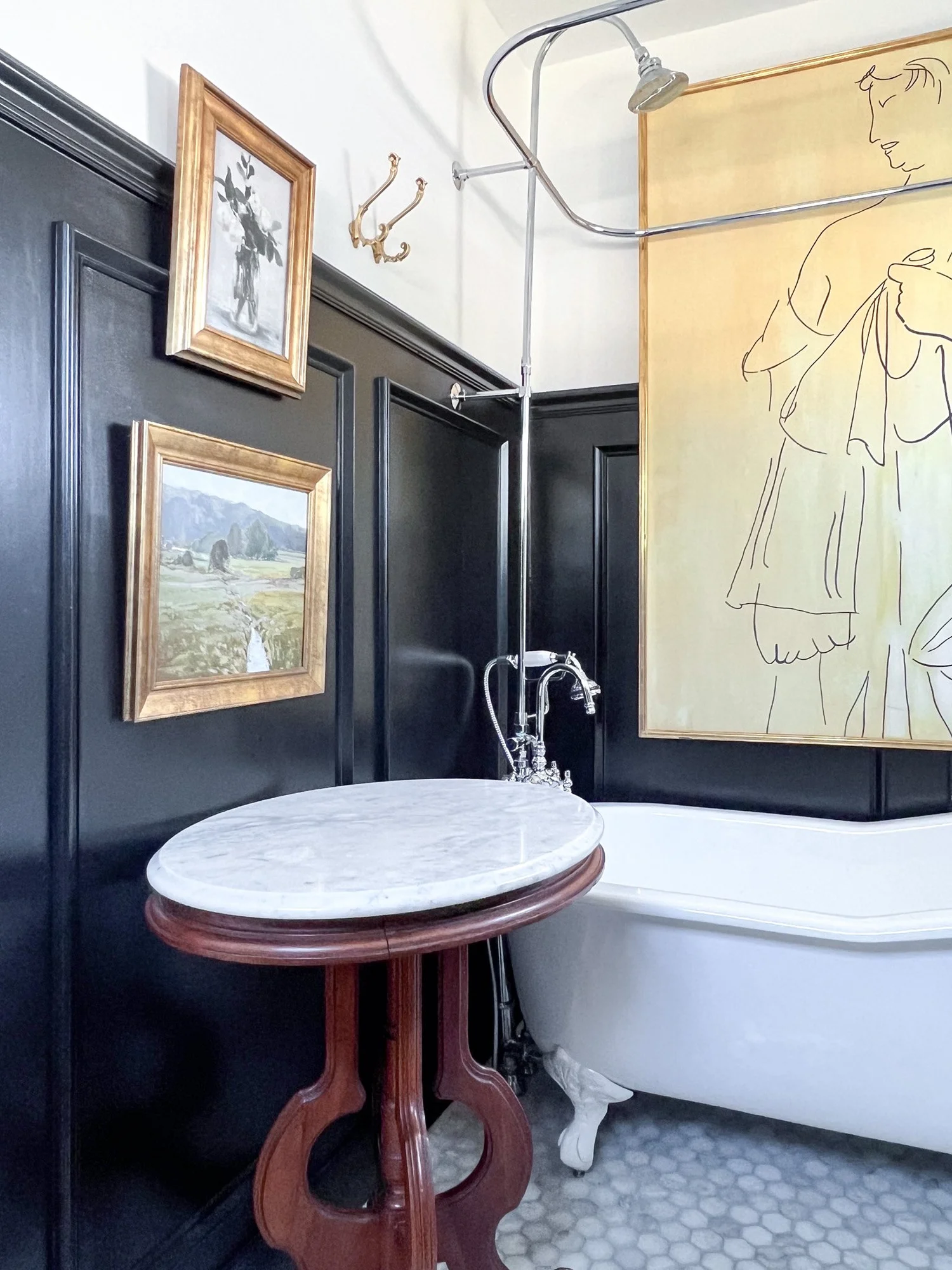
The bathroom had a different brief: Manhattan hotel bathroom meets Parisian flat. That translates to marble octagon mosaic floors (trimmed with a custom border, not left raw), semi-gloss black box trim running two-thirds up the wall, a clawfoot tub, chrome fixtures everywhere, and European antiques (an Italian marble table, gilded artwork) that anchor the space in tradition without feeling stuffy. It's European in sensibility, not geography. The materials could exist in Paris or New York. They happen to be in Arizona. That's the test: does it feel rooted in a design language, or just decorated to match a mood board?
"Dual-purpose spaces require intentional planning. Not just cramming furniture into a room and hoping it multitasks."— The Studio Edit Standard
Office & Guest Suite

Manhattan Hotel Bathroom Meets Parisian Flat


What made this Studio Edit —
not just a guest room with a bathroom.
Dual-Purpose Programming
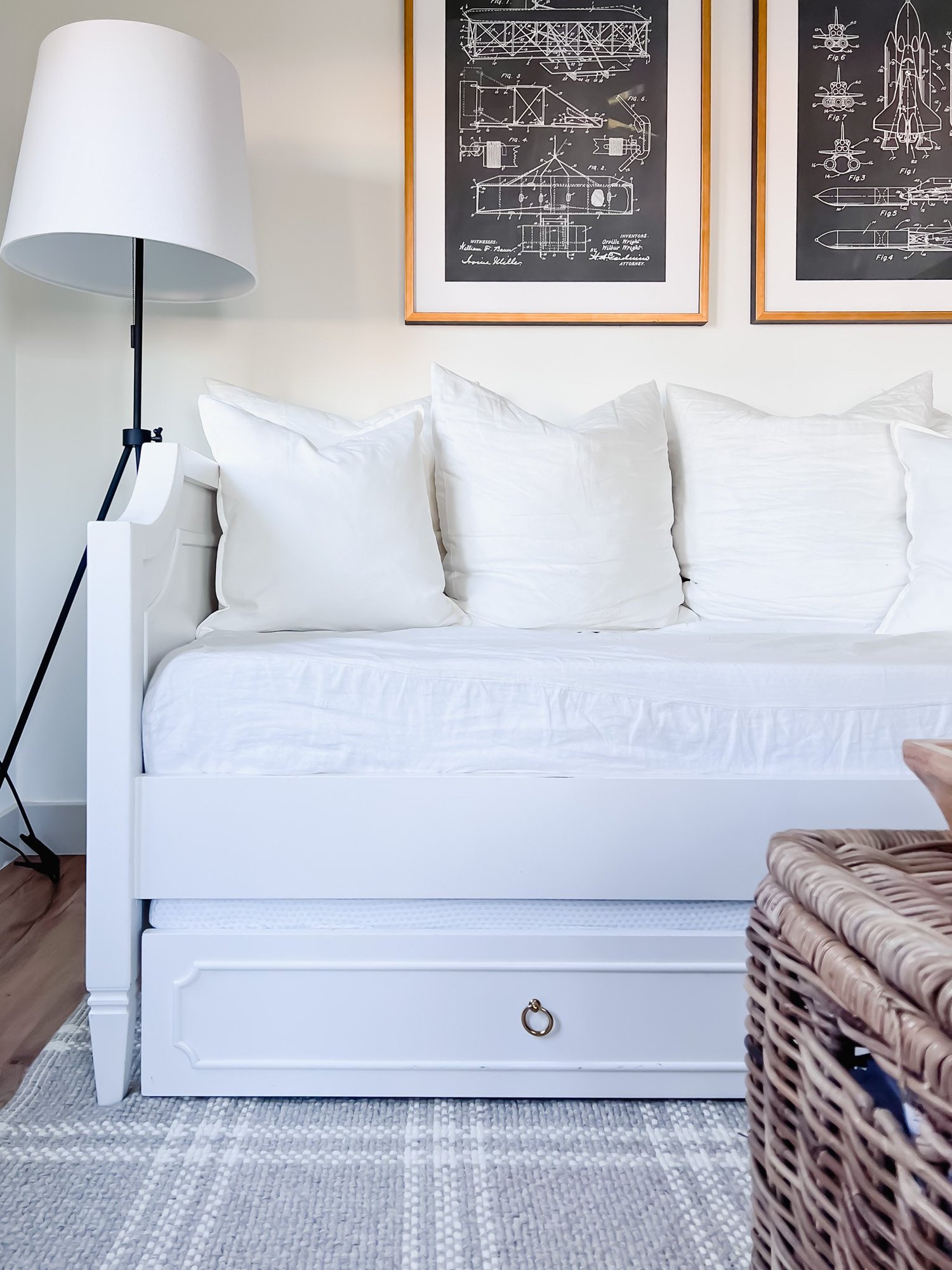
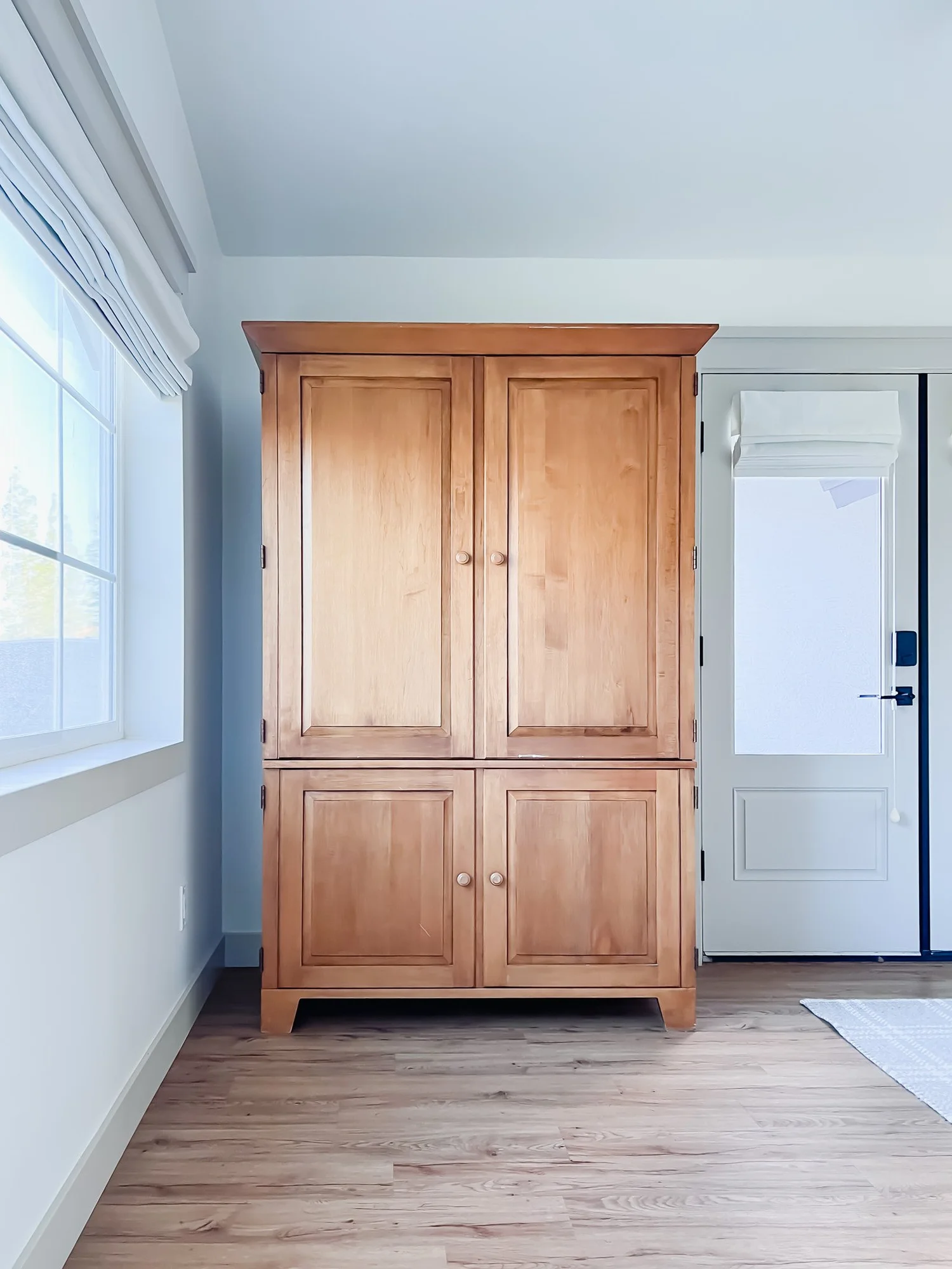
This isn't a guest room that moonlights as an office. It's a purpose-built space designed from the start to serve both functions equally well. That requires different thinking: desk placement that doesn't compete with the bed. Storage that accommodates office supplies and guest linens. Lighting that works for focused tasks and ambient relaxation. Most people furnish dual-purpose spaces by compromise. We designed this one by intention.
Manhattan Hotel Bathroom Meets Parisian Flat
The bathroom brief was specific: Manhattan hotel bathroom meets Parisian flat. That's not a style. That's a sensibility. It means luxury without ostentation. Marble without maximalism. Chrome fixtures everywhere because consistency matters. The clawfoot tub isn't vintage — it's the correct choice for the proportions. The semi-gloss black box trim running two-thirds up the wall creates visual weight without heaviness. This is European in approach, not geography.
Vaulted Ceiling Strategy for Spatial Expansion
Small rooms feel cramped when the ceiling height matches the footprint. The vaulted ceiling here does two things: it draws the eye up (expanding perceived volume), and it creates architectural interest without adding square footage. Most people solve small-space problems by decluttering. We solved it architecturally — which is why this room feels open despite accommodating two full furniture arrangements.
Traditional Millwork with Modern Neutrals
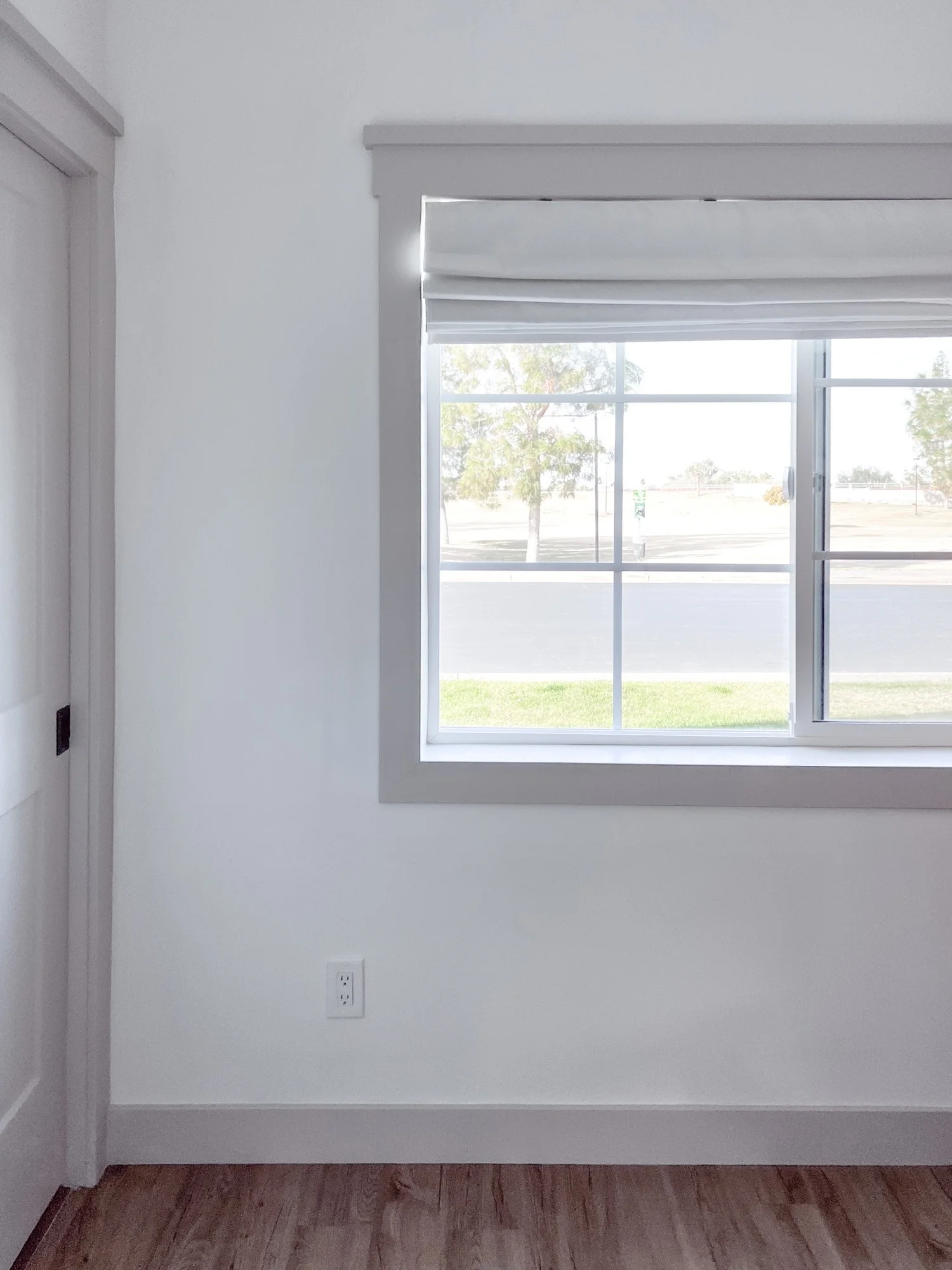
Traditional millwork can feel heavy if you're not careful. The key is the trim color: accessible beige instead of white. It keeps the molding from feeling stark or institutional. The gridded casement windows reference European architecture without copying it. Everything is traditional in form, modern in execution. That balance — respecting heritage without replicating it — is what keeps traditional design from feeling dated.
Marble Octagon Mosaic Floor with Custom Border
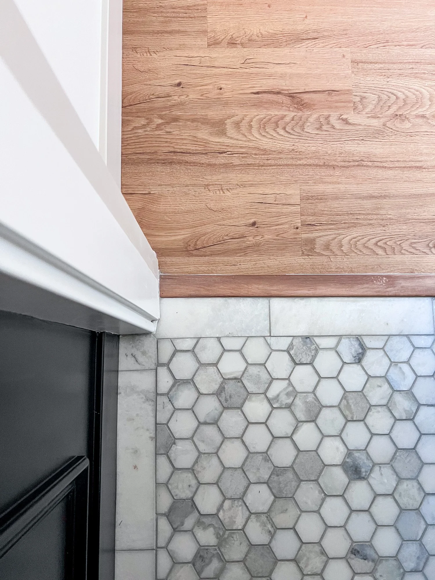
The bathroom floor is 2-inch marble octagon mosaic — not trendy, not dated, just correct. The custom marble border frames the perimeter instead of letting the tile run raw to the walls. That detail costs more. It also elevates the entire space from "nice bathroom" to "considered design." Most people stop at the tile selection. We specify the border treatment, too. That's the Studio Edit difference.
Antique European Elements
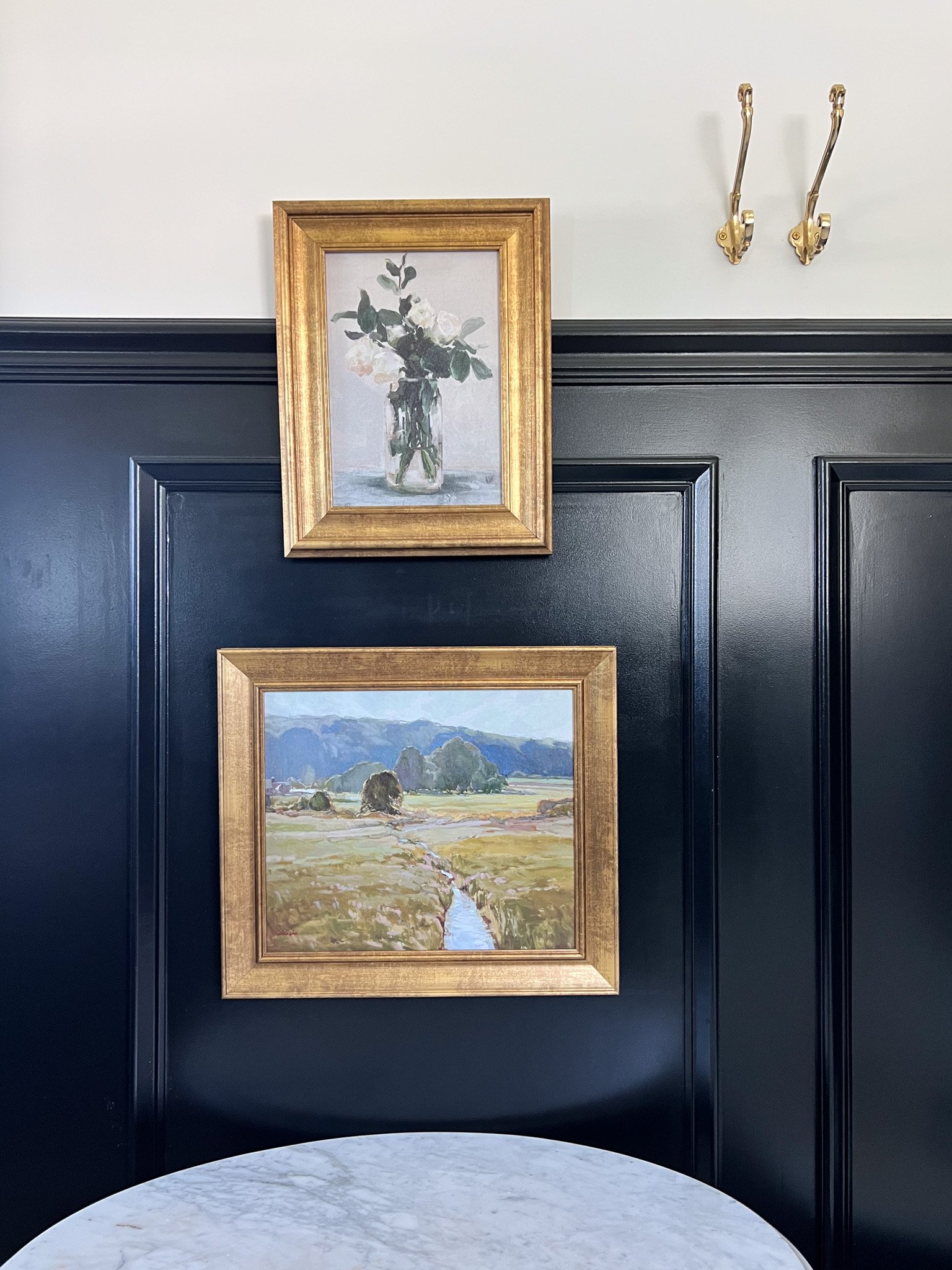
The Italian marble table isn't there because it's old. It's there because its proportions ground the bathroom in European tradition. The gilded still life artwork wasn't commissioned — it was found, which is better. Antiques earn their place by being irreplaceable, not by being expensive. This bathroom has European sensibility because the materials reference a design language, not because we sourced everything from Paris. Sensibility travels. Geography doesn't.
Why Dual-Purpose Spaces Require Studio Edit Thinking
Most people approach dual-purpose spaces by adding more furniture: a desk in the guest room, a daybed in the office. That's decoration, not design. Studio Edit thinking starts with programming: what are the actual use cases? Office work requires focused task lighting, accessible storage, ergonomic seating. Guest accommodation requires ambient lighting, hospitality (somewhere to put a suitcase, hang clothes), privacy. Those needs don't overlap — which means the design has to accommodate both without compromise.
The solution here was architectural: vaulted ceiling for volume. Exterior doors for openness. Traditional millwork for depth. Accessible beige trim to keep everything feeling light. Then we zoned the furniture: desk near the windows for natural light during work hours, bed positioned for privacy and comfort. The bathroom serves both functions equally well — which is why we designed it to hotel standards, not residential afterthought.
European Sensibility in Arizona
The bathroom brief was Manhattan hotel meets Parisian flat — which is a sensibility, not a geography. That means luxury without excess. Marble without maximalism. Chrome fixtures throughout because consistency matters more than variety. The clawfoot tub isn't there for nostalgia — it's there because freestanding tubs create visual lightness in small bathrooms. The semi-gloss black box trim running two-thirds up the wall creates proportion and grounding without making the space feel heavy.
The European elements — Italian marble table, gilded still life artwork — aren't souvenirs. They're authentic antiques that anchor the design in tradition. This bathroom could exist in Paris or New York or Arizona because it's rooted in a design language, not a location. That's the test for Studio Edit work: does it feel like a copy of something European, or does it speak the same design language? We're aiming for the latter.
Material Restraint Across Multi-Room Scope
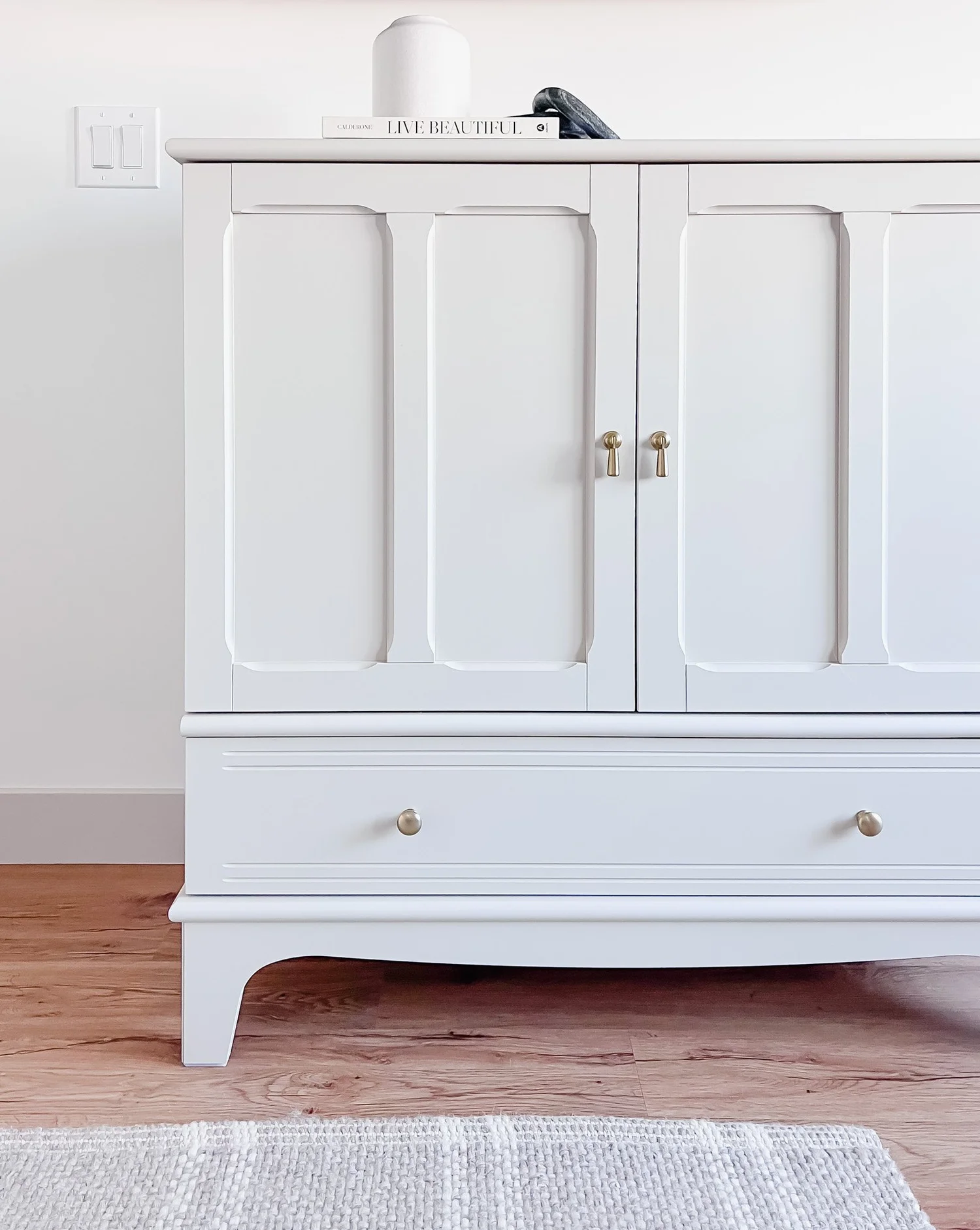
Studio Edit projects span multiple rooms — which means material choices have to work together even when the rooms serve different purposes. The office/guest suite uses accessible beige trim, traditional millwork, gridded casement windows. The bathroom uses marble octagon tile, semi-gloss black box trim, chrome fixtures. Those palettes don't match — but they coordinate. Neutral backgrounds. Traditional detailing. Material quality over quantity. That restraint is what keeps multi-room projects from feeling disjointed.
Most people change materials between rooms to create contrast. We use restraint to create cohesion. The result is a suite that feels intentional, not accidental — which is the entire point of Studio Edit work. We're not just designing rooms. We're designing relationships between spaces.
Ready for multi-room
design that works together?
Studio Edit projects where every space is designed in relation to the others. Cohesive, intentional, rooted in restraint.